By Joey Garfield
MATTEO PERICOLI HAD A ROUTINE. WHEN HE MOVED FROM MILAN TO NEW YORK CITY IN THE 1990s, HE RODE EACH DAY TO THE OFFICES OF HIS ARCHITECTURAL JOB, INSPIRED BY THE IDEA OF DRAWING THE ENTIRETY OF THE MANHATTAN SKYLINE AS ONE CONTINUOUS LANDSCAPE. A RESULTING TWO-YEAR ODYSSEY BECAME A 37-FOOT LONG SCROLL, AN INTIMATE PORTRAYAL OF THE CITY AND ITS INDUSTRIAL BEAUTY: MANHATTAN UNFURLED. PERICOLI RECEIVED THE FIRST COPIES OF HIS FINISHED PIECE IN EARLY SEPTEMBER 2001, AND A FEW DAYS LATER THE PIECE WAS NO LONGER PERSONAL. LIKE ANY GREAT STORYTELLER, PERICOLI’S UNFURLED PROJECT LIVES BEYOND ITS CREATOR WITH A PURPOSE THAT GOES BEYOND AUTHORSHIP. IT BELONGS TO EVERYONE NOW. —JUXTAPOZ
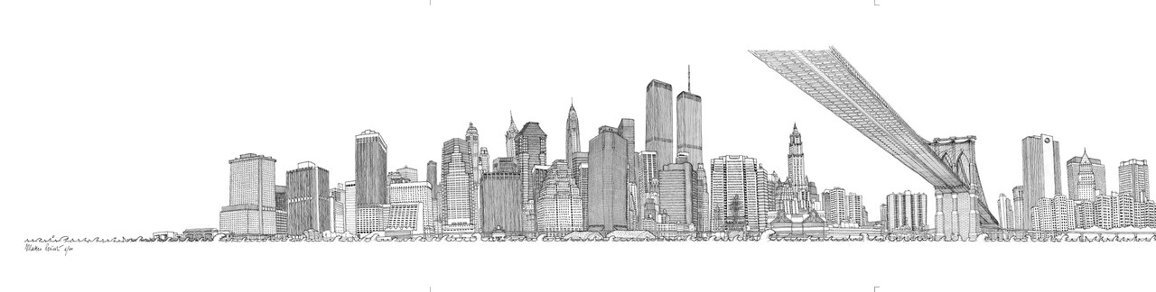
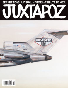
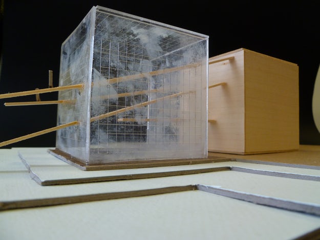
Detail of Manhattan Unfurled – The East Side (used as the cover of the Beastie Boys’ 2004 LP “To the 5 Boroughs”)
Joey Garfield: Where did you grow up?
Matteo Pericoli: I was born and grew up in Milan, Italy. In my family, drawing was like a second language. My father was a painter and satirical cartoonist in the 1970s. That became an extra language I knew how to use, but it remained complex because of my relationship to my father. I ended up going to study architecture and when finished, in 1995, I decided I wanted to move to a place where the architecture tradition was different and I could learn a new approach to what I studied in Milan. I came to New York after graduation and worked as an architect for Peter Eisenman and Richard Meier.
Because I was in New York, drawing just started to resurface out of me like a bubble. The fact is, it was always there within, but in Italy it was never something I considered using. In New York I started to draw everything I could.
What is your approach to traditional drawing versus architectural lines?
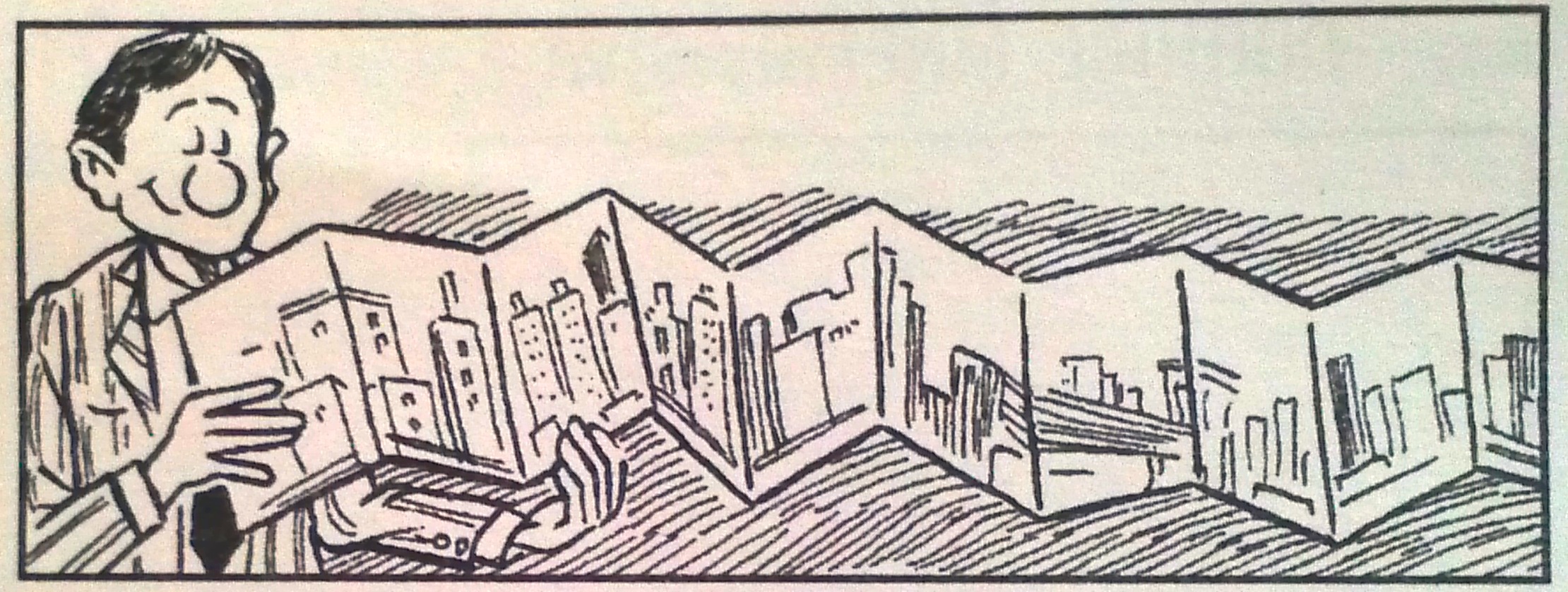
Before the written word was invented, there had to be a drawing. A line drawing, say, of an animal, before the word for it was invented, carried the necessary information. Line drawings are at the doorstep of language. A line can turn into a word much faster then a painting; it is somewhat magical. Drawing is a way to absorb the largest amount of information at one time. With a sketch there is a “maybe,” but not when you draw. You must know all of the lines in order to choose the one line. The strange thing about hard line drawings is they are very readable and look simple because all the work has been synthesized down to what elements will be included. It’s an immense amount of work that disappears before it’s done and people think, “Oh well, it’s just a drawing.”
When did you decide the city would be your subject?
The infatuation with New York, which is instantaneous for anybody who comes here from somewhere else, has to take some kind of shape in order to make it your own. People will write about it, they will photograph it, eat at all the restaurants. Mine was an obsession of “What is it?” The maps were misleading because they all ended at midtown. I wanted to see where I was—from one step back. It was kind of an instinct. I took the Circle Line tour boat that goes all around Manhattan and figured, “This is the viewpoint. I can finally see everything and study the city as one!”
When I was on the boat I saw this big thing that began all the way north at The Bronx and went all the way to the Financial District and thought, “If I can see the whole thing maybe I can draw it.” So I took hundreds of photographs, I took several boat tours, I bought a motorcycle, and went to New Jersey and everywhere I could to photograph. You can’t really make out just one entity of a hundred photographs. It will still be fragmented. But drawing allows you to modify and change perspectives, and make it one simple thing.
How did you begin the project?
In 1998, I started the obsessive drawings of the city. When I started, I thought it would go just from the Bronx bridge to my house. If someone would have told me I was to draw the whole city, I would not have even started. Luckily, I am right-handed so I could start in Inwood and the Cloisters. Had I been left-handed, I wouldn’t have done it because the idea of starting at the Financial District was too much.
I took a roll of sketch paper from the office and began at the northern tip of the island and came all the way down. It took me a year. Because it was a roll of paper and I was in a small apartment, I could only complete a tiny section and then roll it up, start a new section, and roll it up. It may have been ten or eleven feet, but it was invisible because I couldn’t extend it all the way. Over time, your hand changes, but I couldn’t see back. It was all by instinct.
Was it hard to work, for a year on just one thing?
Yes. After I worked on it, every time I closed my eyes at night, I saw New York. You turn mad in a good way.
Do you have a ritual for when you finish a project of this length? Like break your pencil?
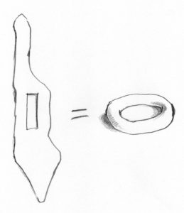
The city is a donut
No, but I should. There is closure. I did go back to some places after I was done to look at them again: when a circle has been completed, it’s calming. But this was just the beginning, because I realized there was another hole right in the center of Manhattan: Central Park. The typical thing in a European city is a dense center with less at the edges. But when you are in Central Park, you are not inside anything, you are actually outside. It’s the reverse. You go inward to go out. The city is a donut!
Do you prefer a pencil or a pen?
Actually, the drawings are in pen. The pencil is the tool I use to think. The pen is the tool I use to archive or fix the one item that is my intention. Also, with the pen you cannot erase. The first line on a blank piece of paper is terrifying, if you make a mistake twenty feet into the drawing, there is nothing you can do. You can’t erase it. There are some lines I was doing with the bridges that are filled with terror.
So if you mess up…
It stays. We used to have a bird, a little wild finch that my wife saved so it thought we were its family. While I would draw, the bird would be flying all around me. Some time just after the Brooklyn Bridge she landed on top of my pen and pecked at it, the pen; and so there is a little mistake somewhere in there.
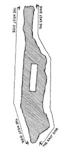
The West and Side drawings
When I finished the West Side I wrote to many folks, journalists and architecture critics, and explained that I had a drawing of the entire city that was 37 feet long, all done on one piece of paper. It had never been done before. The only person who wrote back was Paul Goldberger of The New Yorker. So for the first time, I unrolled the drawing on the floor of The New Yorker offices. Paul knew much more about the city than I did, even after drawing this whole thing. Knowledge can take many shapes. Unfurling it was like a street fair; everyone came out of his or her office to watch.
The West Side was published in The New Yorker in 1999 and then I was commissioned to complete the East Side for the book in 2001. I went to my architecture firm and asked if we could make an arrangement for me not to work on this only on weekends and nights because there were exhibitions, and Random House wanted to make it into a book. The firm declined; so I left. I turned the corner and went back up the other side of the island for the next year.
The quality of the drawing for the East Side is dramatically different to me because it was now my “day job” and I took it more seriously. I was done in 2000. By 2001, we worked on the book and I received the first copies the weekend before September 11, 2001. When the towers fell I took the books, hid them and couldn’t bear to look at them for six months. It took time to realize that this was an act of love given to a place where I lived. It was just all so strange because the drawings included the Twin Towers.
It was hard to know when to return to normal… officially.
You realize the place, as a physical organism, was not the same anymore. Looking was painful. The years spent drawing every single line of the city were very intense, and it hurt because it was not the same. It hurt because the purpose was now from a previous era.
And the door slammed shut pretty hard.
After six months, I brought the book back out. I realized it was actually the last picture drawn of this place as a whole, “whole” meaning with the two towers. I realized that there was nothing negative about having drawn the city. I remembered the energy I had put into it, as it turned out not to be something that I was trying to understand but was rather a kind of gift. The final image of an era, and I felt lighter.
And then you did it again in 2011?
For the ten-year anniversary of September 11th, The New Yorker asked if I could draw just a section of the city.
Was it weird to come back and do it again?
Yes, apart from the fact that it was fantastic to have another opportunity, the reality was that so many things had changed. We can actually see the city progressing. All the efforts to rebuild with the cranes attached to the sky, trying to draw again a new identity. It still feels like reconstructive surgery now, but maybe in a while it will be the total, perfect identity of a place. But the efforts felt heartwarming, not “We are going to make it,” but more “I am going to be myself again.” But it takes time. New York is often misunderstood. It’s two words that don’t fit together but somehow work in unison: Pragmatism and Love.
The project you worked on after, the City Out My Window series, became a book. Can you talk about that?
In 2004, we had to move from our small apartment in Manhattan to Queens. When everything was packed to go, I was in the empty bedroom where I had my desk and worked by the window. When you work, every so often you relax and look out the window. Everybody does it. I estimated I obsessively looked out that window for seven years, 28 days straight. More than any other image of New York, I saw this view. So I thought to myself, “This view has to go with me.” With a photograph you never get the exact viewpoint that really makes the view yours. So I took a large piece of paper, drew what I saw, and took it with me. Then I realized that many people share this same compulsion. When I started to ask other artists and creatives around me, everybody had a great story, love or hate, of their window view. The view was always a character in their life.
We are not animals anymore. We are stuck inside boxes and the hole in the wall is our only separation from the world. I asked everybody about their window views, and Adam Yauch as well because we had worked on the album cover for To the 5 Boroughs together.
How did you connect with The Beastie Boys?
They just wrote me. I think it was Adam’s wife Dechen. I have the note somewhere. She said they knew of the book and were making an album dedicated to the city. They said my drawing was a heartfelt dedication to the city and they would love to use it for the cover. When the goal is simple and shared, there is not much to talk about.
Cover of the June 2013 Beastie Boys issue of JUXTAPOZ


